Compare and Conquer: Visualize Your Portfolio vs. Index Funds!

Jon V
—Jul 08, 2024
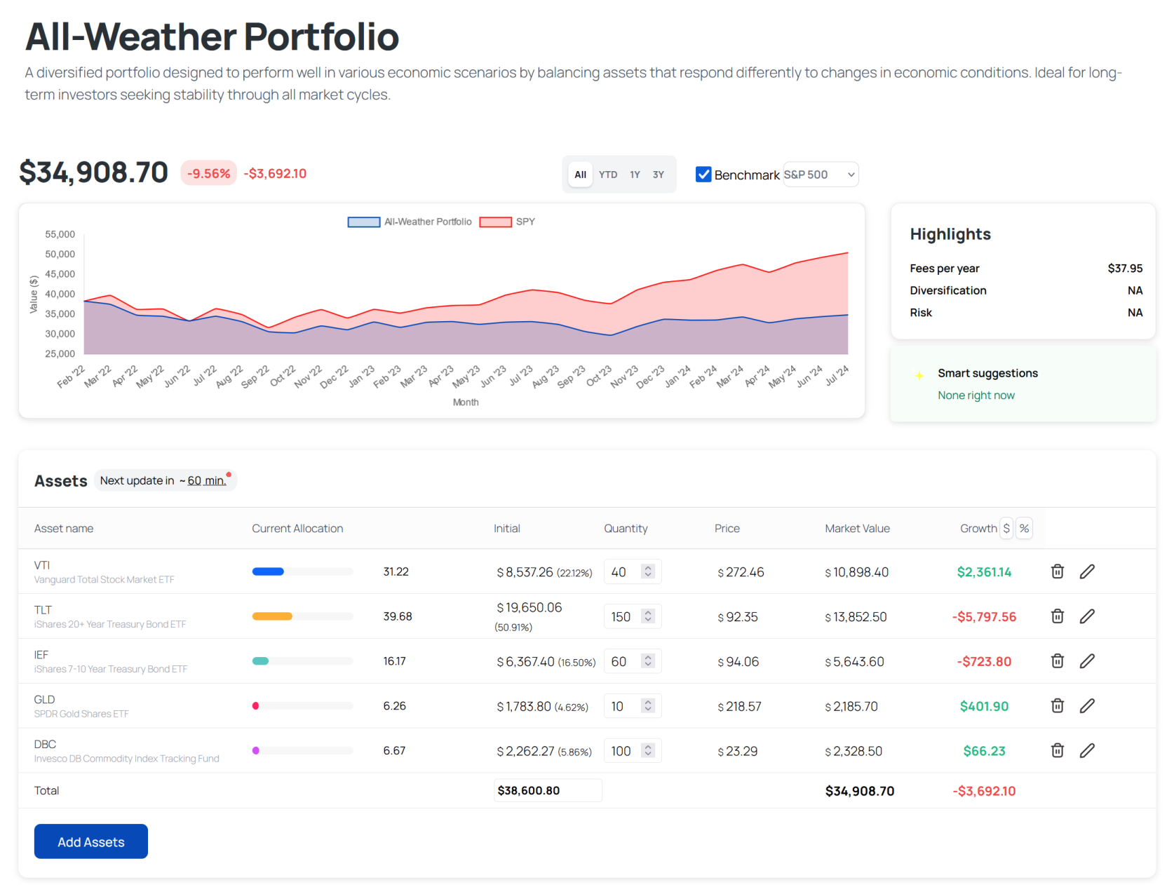
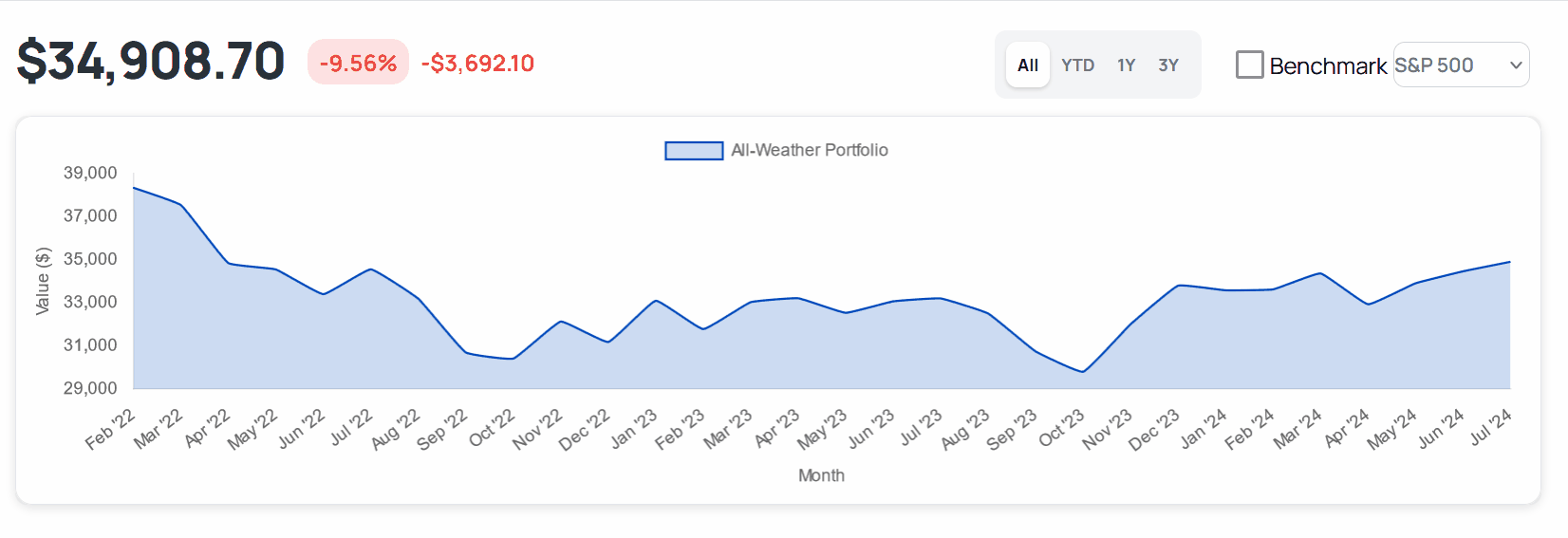
Hey there, amazing investors! Jon V here, and I’m thrilled to announce a powerful new feature on HeyFire. You can now visually compare your portfolio to major index funds like the S&P 500, QQQ, and BTC. This is a game-changer for quickly assessing your investment strategy.
Why You’ll Love This:
- Instant Insights: See at a glance how your portfolio stacks up.
- Easy Comparison: Visual graphs make it simple to understand.
How to Use It:
- Select Your Portfolio: Pick any of your current portfolios.
- Choose an Index Fund: Compare it to the S&P 500, QQQ, or BTC.
- View the Graph: HeyFire will display a visual graph comparison.
Head to our this portfolio and try it for yourself or login and use it on your own
Example: Have a tech-heavy portfolio? Compare it to QQQ and see how you’re doing. Investing in crypto? Stack it up against BTC.
The visual graph shows performance side by side, making it easy to understand.
Why We Built This
We want to make it simple for you to gauge your investments. Visual comparisons provide instant clarity, helping you make informed decisions.
What’s Next?
More features are coming! Look forward to new tools to augment your investing journey.
Join the HeyFire Community: Share your visual comparisons with us, and we’ll feature them on our social media.
Thank you for being part of the HeyFire journey. Together, we’re building something epic.
Be epic, Jon V (as in Victory)