Chart Your Course: Visualize Your Net Worth Like Never Before!

Team HeyFire
—Sep 02, 2024
Hey FireStarters! 🔥
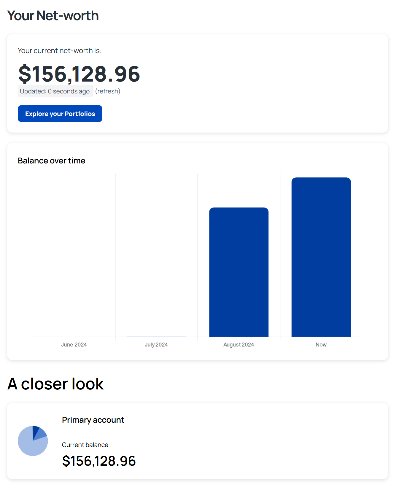
We’re excited to announce a game-changing update to your Net Worth!
Now, you can not only see your overall progress but also get a detailed look at how your wealth is allocated.
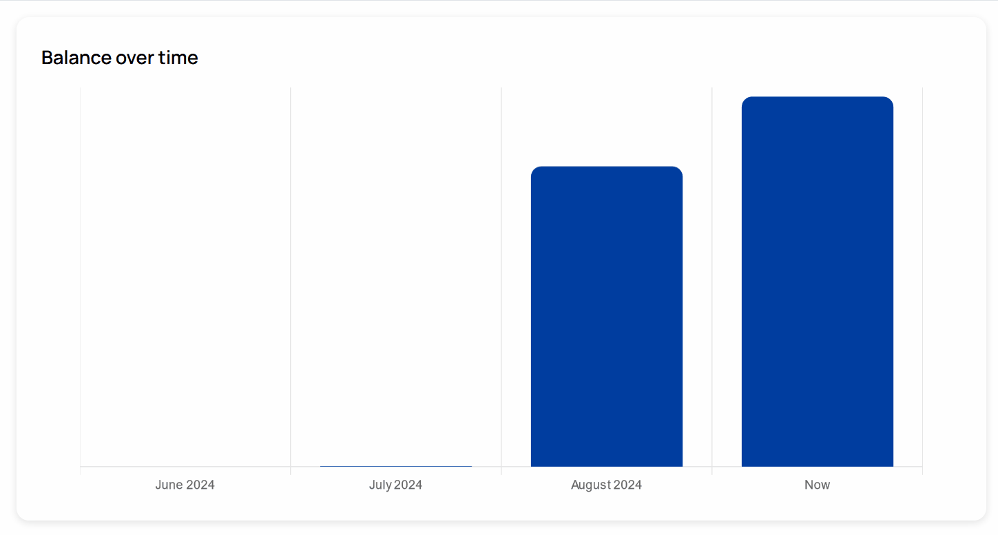
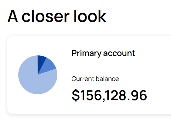
We’ve added two powerful visual tools: a bar graph that tracks your net worth over the last few months, and a pie chart that breaks down your net worth across different portfolios.
Why You'll Love It:
- Bar Graph Brilliance: Watch your net worth grow over time with our easy-to-read bar graph. See the impact of your investments month by month and stay motivated as you reach new financial heights!
- Perfect Pie: Want to know how your assets are distributed? The pie chart shows you exactly how your net worth is allocated among your portfolios, giving you a clear snapshot of where your money is working hardest.
This new feature is all about giving you the insights you need to make smarter investment decisions. Whether you’re rebalancing your portfolio or just tracking your progress, these visuals make it easier than ever to stay on top of your finances.
Head over to your Dashboard page now to see it in action!
Be epic, Jon V (as in Victory)
Let’s keep growing together! 🌱